
Amelia’s Bakehouse – Brand Launch
We’ve cultivated a unique visual system and strategy across everything Amelia’s Bakehouse does, it’s fun, playful and just the right amount of professional to be reputable brand in its hometown of Ealing.
We’ve cultivated a unique visual system and strategy across everything Amelia’s Bakehouse does, it’s fun, playful and just the right amount of professional to be reputable brand in its hometown of Ealing.
BRIEF
What happens when a family run business in Ealing is about to be taken over by an innovative bakery company that have previously proven themselves in America already? They bring a WHOLE new offering, and for that, they needed something powerful, straight to the point that would grab people’s attention, and so they came to RUDE.


PROCESS
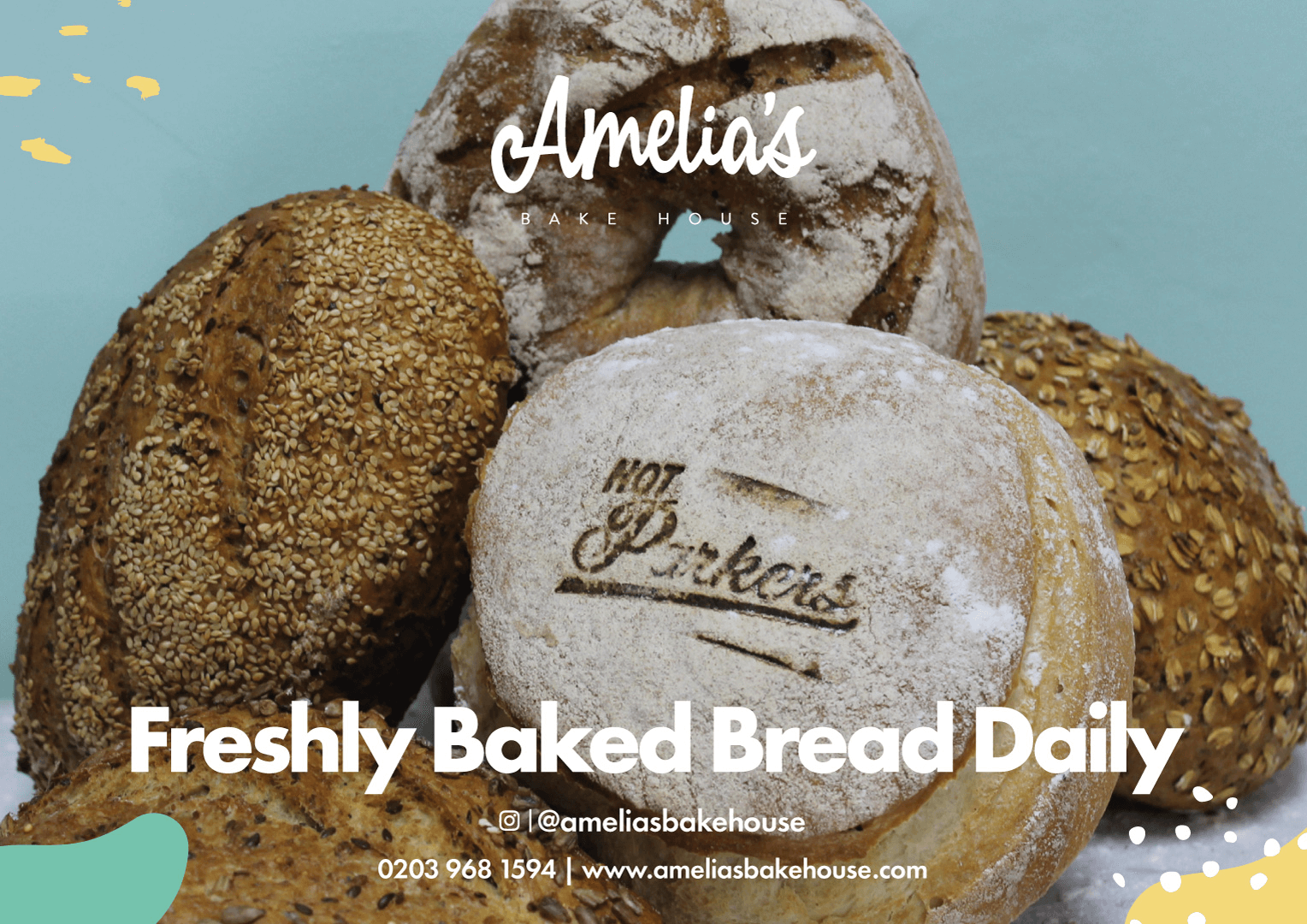
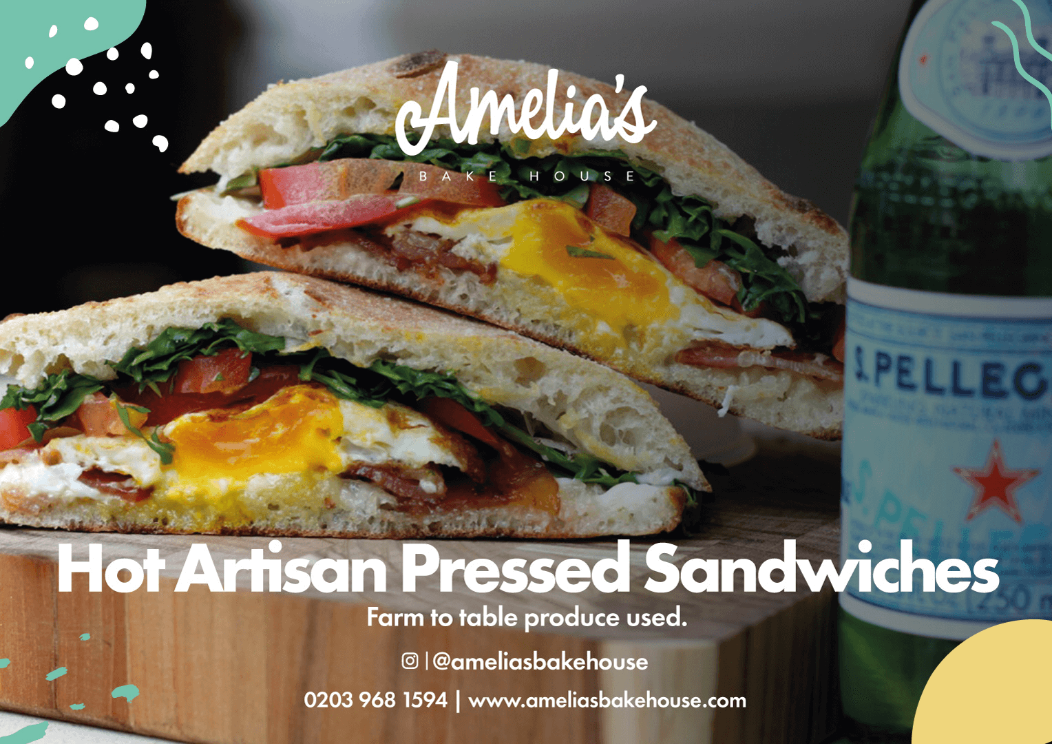
Amelia’s logo was born through a very fun and playful typeface, and then finished with the ‘Bake House’ underneath in a serif font, it didn’t need to be in your face, it just needed to complete the logo. We then developed a colour palette which has been used significantly, all over the shop, the artwork and all over their social media. Amelia’s Mint is the primary colour, doing a lot of the talking, but then it is complimented by Amelia’s Navy due to the contrast. Every piece of Amelia’s artwork has its shapes in some form, on the borders, this creates instant consistency to the brand.

RESULTS
RUDE works with Amelia’s Bake House on a regular basis, creating social media posts and posters and flyers. We have developed a strong relationship with them and have embodied their brand completely. Since their February launch, we have worked with them entirely to make sure that their digital marketing and branding is always kept to a consistent and high level standard.
Let’s collaborate
We’re a branding & marketing studio who are excited about making a difference, we care, we’re not rude, we are R U Doing Enough!